Draw a Polar Dendrogram
Will's pick this week is Draw a Polar Dendrogram by Sam Roberts.
If I hadn't chosen aerospace engineering for a career, genetics would have been a wise alternative. In recent years, it's become one of those peculiar hobbies of mine. I suppose that the combination of large data sets, statistical methods, and a dash of human history appeal to me.
Years ago, I decided to have the genes in my Y chromosome examined. The specifics of my Campbell lineage become murky around 1800 such that I can't tell you how I relate to the vast majority of people named Campbell around the world. In lieu of a paper trail, I was curious to see if a DNA test would show any commonality with the Duke of Argyll, the head of the Campbell clan. Sure enough, our results were similar. The values vary slightly due to mutations amassed over the generations, but they were close enough to indicate that it's no fluke we have the same surname.
The service that conducted the analysis provided statistical estimates of the time in which the Duke and I shared a common ancestor. Rather than take the estimates at face value, the engineer/genetics enthusiast in me wanted to understand how they were calculated. While this is an interesting topic, the details aren't worth exploring here. Suffice it to say that I wrote MATLAB code that produces probability curves for when two men shared a common ancestor.
Months after having achieved this, it occurred to me that I could advance this notion one step further by applying it to groups instead of individuals. I extracted the peak of the probability distribution between every pair of individuals in the group. This enabled me to create a matrix of genetic distances, which I called MODE. Row 1 and Column 1 show the expected number of individuals separating him from all the other group members. Row 2 and Column 2 show the distance of member 2 to others, and so forth.
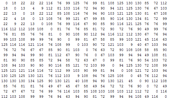
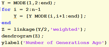
With a few lines of code, I was able to reshape this into a distance vector, supply that to the Statistics Toolbox function linkage, and voila, create a dendrogram. In effect, I have a family tree showing how and when different Scottish clans diverged. (I threw in some Irish names for good measure).

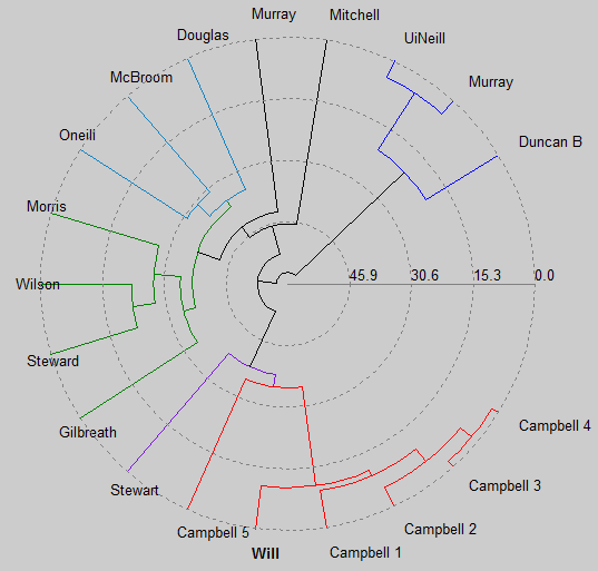
As I said, I'm no expert on this subject, thus I have no idea how accurate this diagram is. I can tell you that when I change the metric argument to linkage, I get radically different results. But even if the details aren't perfect, I appear to be on the right track. All the Campbells cluster together as you would expect. Five of us split around 1600 or so, while another broke off around 1000 AD. The common ancestor for everyone is about 60 generations ago, which works out to around the time the Romans abandoned Britain. However, this is probably misleading since my analysis doesn't account for the possibility of back mutations.
At long last, we come to the Pick of the Week. Diagrams like this are fun, but is there any way to make it even more exciting? This is precisely what Sam has figured out how to do. His submission displays a dendogram on a polar projection. The code he employs is simple and easy for me to understand, enough so that I felt comfortable making alterations within ten minutes (I updated the labeling to display the surnames). So even though it's been a long time coming (the code has been available for 5+ years), congratulations to Sam on his fine work!
Comments
Let us know what you think here or leave a comment for Sam.
If I hadn't chosen aerospace engineering for a career, genetics would have been a wise alternative. In recent years, it's become one of those peculiar hobbies of mine. I suppose that the combination of large data sets, statistical methods, and a dash of human history appeal to me.
Years ago, I decided to have the genes in my Y chromosome examined. The specifics of my Campbell lineage become murky around 1800 such that I can't tell you how I relate to the vast majority of people named Campbell around the world. In lieu of a paper trail, I was curious to see if a DNA test would show any commonality with the Duke of Argyll, the head of the Campbell clan. Sure enough, our results were similar. The values vary slightly due to mutations amassed over the generations, but they were close enough to indicate that it's no fluke we have the same surname.
The service that conducted the analysis provided statistical estimates of the time in which the Duke and I shared a common ancestor. Rather than take the estimates at face value, the engineer/genetics enthusiast in me wanted to understand how they were calculated. While this is an interesting topic, the details aren't worth exploring here. Suffice it to say that I wrote MATLAB code that produces probability curves for when two men shared a common ancestor.
Months after having achieved this, it occurred to me that I could advance this notion one step further by applying it to groups instead of individuals. I extracted the peak of the probability distribution between every pair of individuals in the group. This enabled me to create a matrix of genetic distances, which I called MODE. Row 1 and Column 1 show the expected number of individuals separating him from all the other group members. Row 2 and Column 2 show the distance of member 2 to others, and so forth.

With a few lines of code, I was able to reshape this into a distance vector, supply that to the Statistics Toolbox function linkage, and voila, create a dendrogram. In effect, I have a family tree showing how and when different Scottish clans diverged. (I threw in some Irish names for good measure).


As I said, I'm no expert on this subject, thus I have no idea how accurate this diagram is. I can tell you that when I change the metric argument to linkage, I get radically different results. But even if the details aren't perfect, I appear to be on the right track. All the Campbells cluster together as you would expect. Five of us split around 1600 or so, while another broke off around 1000 AD. The common ancestor for everyone is about 60 generations ago, which works out to around the time the Romans abandoned Britain. However, this is probably misleading since my analysis doesn't account for the possibility of back mutations.
At long last, we come to the Pick of the Week. Diagrams like this are fun, but is there any way to make it even more exciting? This is precisely what Sam has figured out how to do. His submission displays a dendogram on a polar projection. The code he employs is simple and easy for me to understand, enough so that I felt comfortable making alterations within ten minutes (I updated the labeling to display the surnames). So even though it's been a long time coming (the code has been available for 5+ years), congratulations to Sam on his fine work!

Comments
Let us know what you think here or leave a comment for Sam.
- Category:
- Picks


Comments
To leave a comment, please click here to sign in to your MathWorks Account or create a new one.