MATLAB example: Don’t reinvent the wheel
I love a good visualization of data, and often cringe when I see data in a table that would be much more effective as a graph. As with many people in Boston today, I am trying to decide what to do about the impending snow storm tomorrow. Last year in a similar storm, my 20 minute commute became a six hour ordeal.
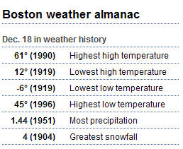
That brought me to Boston.com for the weather outlook. I found this chart:

Now, I wanted to see what this would look like as a graph. I thought it would be cute to do an actual thermometer. That just struck me as something that someone else would have wanted to do already, so I went to MATLAB Central File Exchange. One search later brought me to the file I wanted.
This file would produce output like this:

I wanted something like this though:

In the original, you could not get ranges to overlap, so I needed to use the individual data points. The problem was that by default, all the text would be to the right. However, the subfunction that drew this text took in input to say which side to to put the text!

So Eric had thought ahead. However, the code that calls this always sets left to false.

I was looking for a quick and dirty way to do this visualization, so I set that flag like this:

Now, when the string I am using has “High” in it, I will get what I want. I did a little constant tweaking to get the text a little farther left and I was done.
The lesson here is that when using MATLAB, there is very often someone else that has made some code that you could use. It might be one of our toolboxes, or it might be something that another MATLAB user made. It reminds me of a great quote from grad school:
“Two weeks in the lab will save you five minutes in the library.”
Once you have that code, feel free to modify it for your specific needs like I did. That is why it is there.


댓글
댓글을 남기려면 링크 를 클릭하여 MathWorks 계정에 로그인하거나 계정을 새로 만드십시오.