Beeswarm Plot
Jiro's pick this week is plotSpread by Jonas.
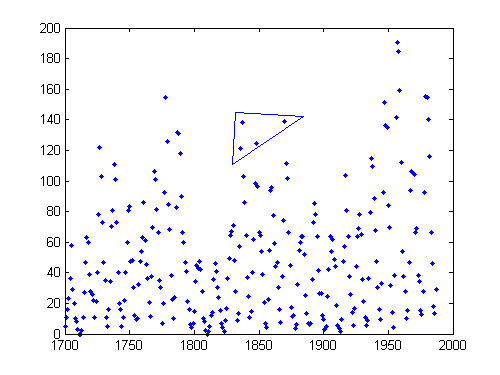
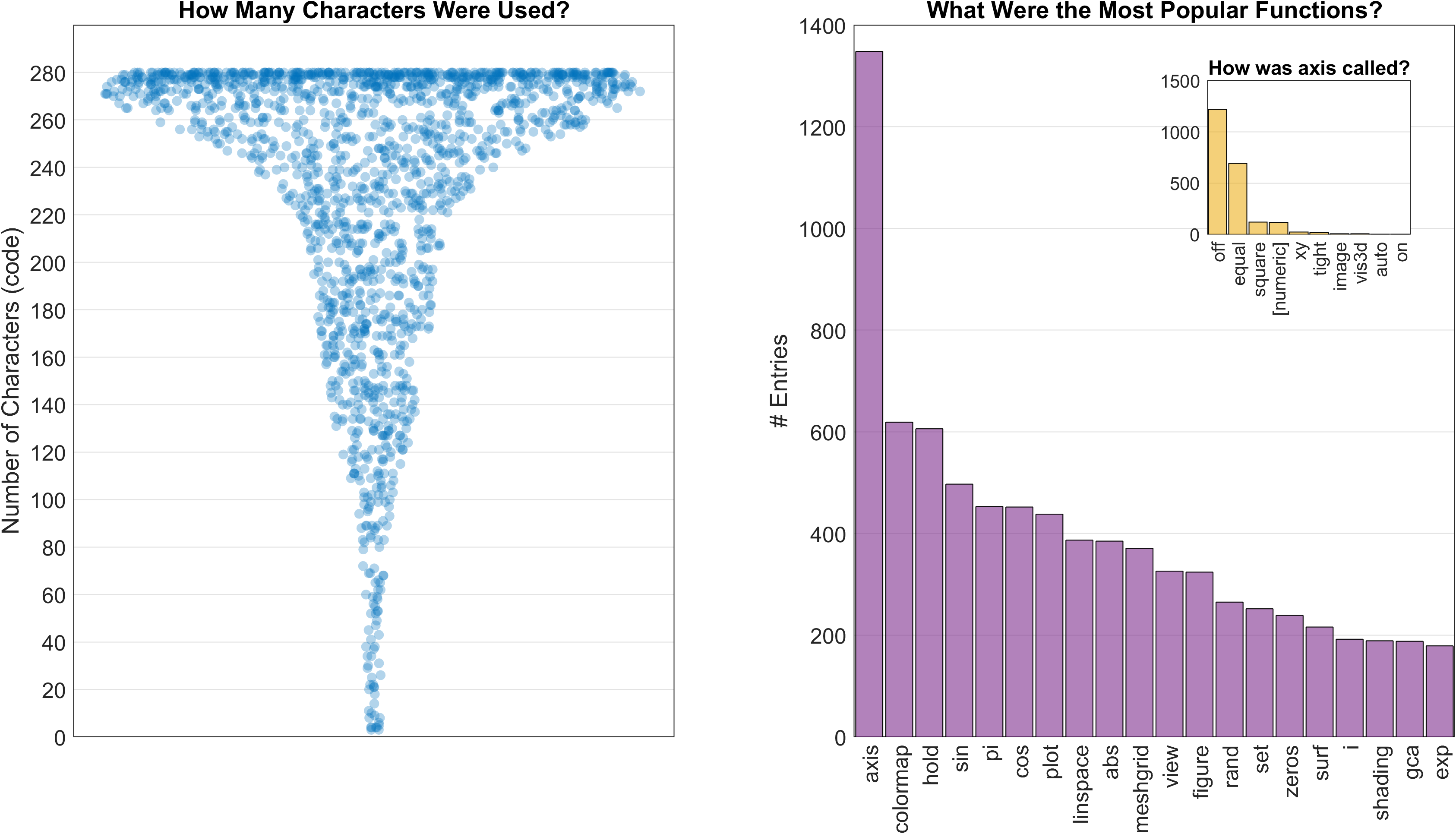
I always keep an eye out for interesting visualizations, and Jonas's plotSpread caught my attention. Last year, I highlighted a utility that overlayed jittered data points on top of box plots. plotSpread also allows you to visualize the distribution of data points using cloud of points, and the width of the jitter can represent the number of points within the proximity of each other, i.e. the fatter the spread, the more points within that region.
data = {randn(25, 1), randn(100, 1) + 1, randn(300, 1) - 0.5};
plotSpread(data, ...
    'xNames', {'25 pts', '100 pts', '300 pts'}, ...
    'distributionMarkers', {'o', '+', '.'});
The plot can be customized in many different ways, and Jonas includes a detailed help for the various options. I was happy to see him use the inputParser to error-check the numerous optional inputs he had. In fact, more than half of his ~500 lines of code is for error-checking. Thanks for making the utility robust!
Comments
Give it a try and let us know what you think here or leave a comment for Jonas.
- 범주:
- Picks


댓글
댓글을 남기려면 링크 를 클릭하여 MathWorks 계정에 로그인하거나 계정을 새로 만드십시오.