
Ridgeline Visualization
Jiro's Pick this week is joyPlot by Santiago Benito.
I must admit that I was simply drawn by the visualization, rather than the name of the function, as I was not familiar with the band or the music album. It was interesting to read the back story.
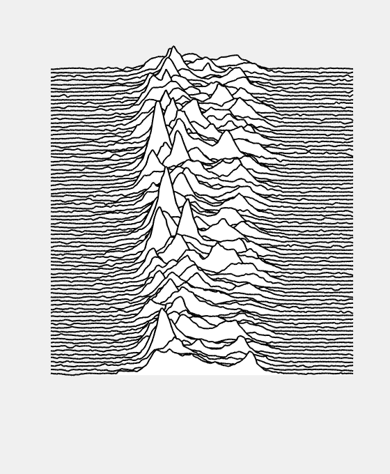
The visualization is a stacked plot with overlap, resembling a ridgeline. Here is an example from the sample code that Santiago includes with his entry.
data = readmatrix(websave('pulsar.csv',['https://gist.githubusercontent.com/borgar/',...
    '31c1e476b8e92a11d7e9/raw/0fae97dab6830ecee185a63c1cee0008f6778ff6/',...
    'pulsar.csv']));
x = linspace(0,93,size(data,2));

joyPlot(data',x,4)
set(gcf,'position',[500,100,560,680],'InvertHardcopy','off')
set(gca,'Visible','off', 'box','off','XTick',[],'YTick',[])
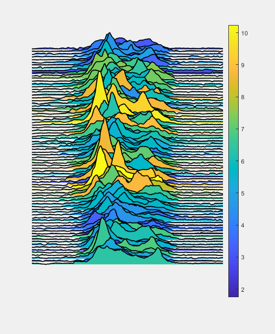
The function has a number of options for customization. For example, you can add colors to the plot. In this case, the colors represent the mean values of each signal.
joyPlot(data',x,4,'FaceColor',mean(data,2))
colorbar
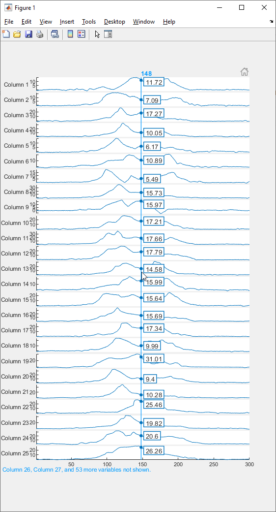
If you have R2018b or newer, you may be interested in stackedplot. It will display multiple signals with common x values on a stacked plot. It has an interactive cursor which displays the values. Note that for data sets such as this one which has many signals, the number of signals displayed is limited by the size of the figure.
stackedplot(data')
Comments
Give it a try and let us know what you think here or leave a comment for Santiago.
- 범주:
- Picks


댓글
댓글을 남기려면 링크 를 클릭하여 MathWorks 계정에 로그인하거나 계정을 새로 만드십시오.