
Excess Mortality Analysis for the USA
Today's guest blogger is Jos Martin, from the Parallel Computing team at MathWorks. Whilst normally focussing on making parallel computing both easy and fast in MATLAB, occasionally he likes to use MATLAB to explore other problem spaces. Here, he writes about using some CDC provided datasets in MATLAB to analyse and visualize excess death statistics across the US.
Contents
Introduction
I was curious to see data on how different US states were dealing with the pandemic and the evolution of the virus over time across the whole continent. I couldn't find any visualisations that told me what I wanted to know, so I started experimenting with examining data for myself. I'm a MathWorker so obviously I turned to my favourite analysis tool, MATLAB!
One of the issues we face when looking at the impact of SARS-COV-2 (COVID-19) on a population is that testing for and ascribing cause from the virus is fraught with problems. Different tests have different specificities, false positives and false negatives; not all the population is tested, and even those that are tested and return positive tests may or may not have symptoms, and may or may not ultimately die from the virus. Thus working out what is actually going on is difficult. Just as an example of this issue on 12 August 2020 Public Health England revised down the number of COVID-19 deaths in England by ~12% due to changes in how deaths may or may not have been impacted by COVID-19.
Given that a bottom up approach of classifying every event (hospitalization, death, etc.) as due to COVID-19 or not is going to be difficult, what we can do is look at the overall aggregate statistics for a population and ask how they differ from normal (or previous data without the effects that are currently being observed). Where the data differs from past years we know that this is probably due to those effects. An excess mortality analysis is of this type. It simply looks at the total number of deaths reported in a given region and tracks that over time to build up a reasonable model for the expected number of deaths (usually during a given week of the year). An example of such an analysis is the EUROMOMO Project (for Europe) which collects this data for a number of countries around Europe and provides different views of the data to help show how current events are impacting deaths in different places.
The equivalent data for the USA is available from the CDC but has much more limited viewing options and I was particularly keen to see how different states were dealing with the pandemic and comparing the evolution of the virus over time across the whole continent.
Getting the Data
The following analysis is done on the data available from the CDC where the total number of deaths are recorded and can be compared to the expected number of deaths in that week from prior years data. We can use the MATLAB webread function to simply import all the data directly from the CDC website (National and State Estimates of Excess Deaths) and start working with the data. Since the underlying data is tabular in a CSV file the result in MATLAB is going to be a table
t = webread('https://data.cdc.gov/api/views/xkkf-xrst/rows.csv');
To help plot the data on a geobubble chart it is useful to have another table that has the names of states (and other locations like "New York City" found in the above data) along with a Latitude and Longitude for that location
locations = webread("https://blogs.mathworks.com/images/loren/2020/stateLocation.csv");
Initial Data Scrubbing
We ONLY want to look at the "All Causes" data (as there are other partitions of the data in this CSV file) and we want all the data to be weighted to predicted values (since the recent data often lacks reported deaths since it takes time to get that data to the CDC - see technical note on the CDC site).
Convert Type, State and Outcome to categorical as this simplifies much of the following code which sub-selects and joins on these variables. Convert ExceedsThreshold to a logical as this is easier to deal with that a set of different strings.
t.Type      = categorical(t.Type);
t.Outcome   = categorical(t.Outcome);
t.State     = categorical(t.State);

t.ExceedsThreshold = strcmp(t.ExceedsThreshold, 'true');
Also convert State in the locations variable to a categorical as we are going to use it in conjunction with State in the main table later on.
locations.State = categorical(locations.State);
Select the data we want (All causes and Predicted (weighted)) and remove the general State == "United States" which is the amalgamated data for all the states
t = t(t.Type == "Predicted (weighted)" & t.Outcome == "All causes" & t.State ~= "United States", :);
Get a time range covering all the data for later use
timeRange = unique(t.WeekEndingDate);
What's Happening in Massachusetts?
Sub-select the data using the State variable (you can change this to any state you prefer to see what is happening in that state)
m = t(t.State == "Massachusetts", :);
Plot both the observed number of deaths over the time period, along with the upper bound threshold which represents the expected number of deaths plus several standard deviations of the distribution. Where the number of deaths is significantly more than the upper bound there is significantly more excess mortality than expected.
plot(timeRange, m.ObservedNumber, 'b');
hold on
plot(timeRange, m.UpperBoundThreshold, 'r')
grid on
title 'Recorded Deaths per week'
ylabel 'Total number of recorded deaths per week'
hold off

[ Mid Sept 2020 comment ] Good to see that for the last several weeks the excess mortality seems to be returning under the upper bound which suggests that MA has returned its mortality rates to close to normal even though there is still a pandemic across the US and the world.
How About the Whole of the USA?
What does the same data look like if plotted across the whole of the USA? Whilst we removed the aggregate numbers from the table earlier we can easily reproduce them by grouping the data by its date and summing across all the states. Use findgroups based on the WeekEndingDate to define the groups of data that all have the same week ending date so that splitapply on these groups can sum all the numbers for all states in each group to get the correct aggregate numbers.
G = findgroups(t.WeekEndingDate);
plot(timeRange, splitapply(@sum, t.ObservedNumber, G), 'b')
hold on
plot(timeRange, splitapply(@sum, t.UpperBoundThreshold, G), 'r')
grid on
title 'Recorded Deaths per week'
ylabel 'Total number of recorded deaths per week'
hold off
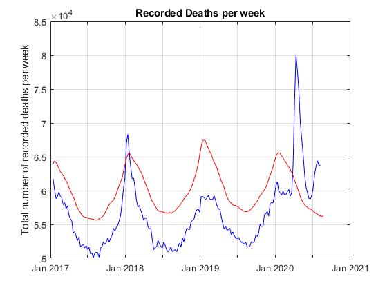
[ Mid Sept 2020 comment ] Note the significant spike during winter 2017 - 2018 flu season. In addition it appears that across the whole of the USA excess mortality doesn't seem to returned under the upper threshold, is running about 8,000 per week higher than expected for this time of year, and appears to be on an upward trend.
How Many States are Exceeding their Upper Bound?
Given that we know at any given time if a State is exceeding its threshold we can easily plot the number of states that exceed their upper bound for the time range.
plot(timeRange, splitapply(@sum, t.ExceedsThreshold, G));
grid on
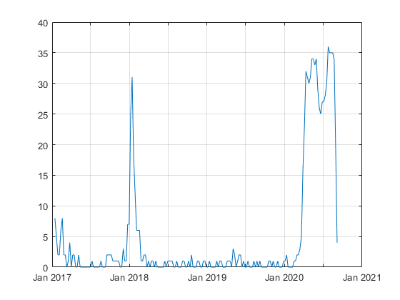
Again note the significant jump in the flu season for 2017-2018, and that currently about 30 states are still above their upper bound. But this is just an aggregate number, it might be interesting to see which states are currently above their bound and to see the evolution of the pandemic across the continental USA over time by tracking which states exceeded their bound at a given point in time.
Which States are Exceeding their Upper Bound?
To look at which states are exceeding their upper bound (and by how much) we need to look at a point in time. We will measure this as a number of weeks since the latest data were recorded. We can then sub-select all the data so that we only have a particular week to analyse. Change the value below to see what happens week by week across the US
weeksAgo = 1;
X = t(t.WeekEndingDate == timeRange(end-weeksAgo), :);
Use the location table joined with the data on State so that we now have the Latitude and Longitude of the States on our geobubble chart
% Join tables
X = outerjoin(X, locations, 'Type', 'left' ,'Keys', {'State'});
The bubble size should be normalized by the expected number of deaths in a given state. So compute the excess mortality (Observed - upper bound) and divide by something like the standard deviation (upper bound minus expected). This number is essentially the number of standard deviations from the expected for that State.
X.BubbleSize = max((X.ObservedNumber - X.UpperBoundThreshold)./(X.UpperBoundThreshold-X.AverageExpectedCount), 0);
Convert ExceedsThreshold to a categorical so that it can label the geobubble chart and set the plot limits to roughly the edges of the continental USA.
X.ExceedsThreshold = categorical(X.ExceedsThreshold);
X = X(X.ExceedsThreshold == "true", :);
geobubble(X, "Latitude", "Longtitude", ...
    "Basemap","darkwater", ...
    "SizeVariable", "BubbleSize", ...
    "ColorVariable", "ExceedsThreshold", ...
    "MapLayout", "normal", ...
    "SizeLimits", [0 10]);

geolimits([20 51], [-126 -65])

This plot shows which states are exceeding their expected threshold and the size of the bubble indicates (in a population normalized way) by how much they are over. By changing the slider above (i.e. changing the week you are looking at) you can investigate the evolution of the pandemic across the states, watching its evolution mostly from the east coast at the beginning of the pandemic to the southern states more recently.
Please download the MLX file for this example, and investigate the data and its implications for yourself. Let us know what you find here.
- Category:
- Education,
- How To,
- News


Comments
To leave a comment, please click here to sign in to your MathWorks Account or create a new one.