
Distribution Plot
Bob's pick this week is Distribution Plot by Jonas.
The Statistics Toolbox includes a boxplot function. The following data shows how the fuel economy of some passenger cars varies with number of cylinders for example.
load carbig
boxplot(MPG,Cylinders)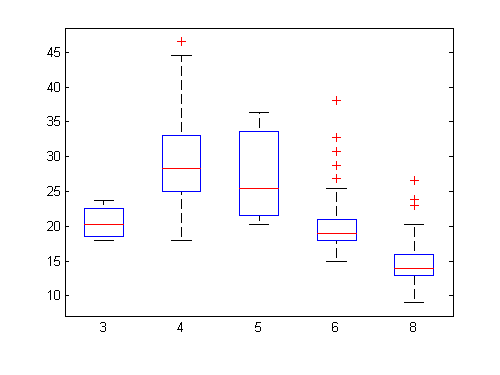
The graphical representation of statistical parameters like min, max, mean and median provide some useful insight.
I will reformat the MPG vector into a 2D array for column indexing.
c = unique(Cylinders);
mpg = nan(numel(MPG),numel(c));
for i=1:numel(MPG)
  mpg(i,Cylinders(i)==c) = MPG(i);
end
Then I can use distributionPlot to make a two-dimensional histogram (see also hist) for comparison. I like heat maps so I'll choose just gray levels.
distributionPlot(mpg,-1,0,c)
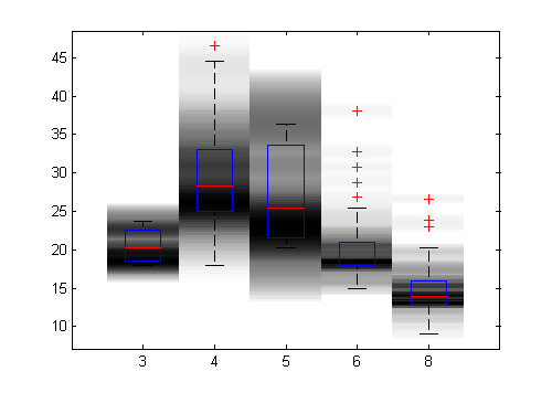
Notice how I got some other behaviors for free. I intended to use "hold on" to overlay both types of plots but Jonas saved me a little work. He also chose to draw histogram patches behind my boxplot so I didn't even have to worry about call order. I did not expect either, but I like both.
Check out his screen shots for more variations such as making the widths of each histogram bin vary with density. Thanks, Jonas!
- Category:
- Picks


Comments
To leave a comment, please click here to sign in to your MathWorks Account or create a new one.