
High-Dimensional Visualization with Bubbleplot
Jiro's pick this week is bubbleplot by Ameya Deoras.
Ameya was a fellow MathWorker and also helped us with this Pick of the Week blog. He's now working at a financial firm.
I'm always impressed with his MATLAB programs. They are extremely useful and very well written. One of my all-time favorites is Intelligent Dynamic Date Ticks, which I also highlighted as a Pick. This was a must-have tool, especially before R2014b, when working with data represented as dates. In R2014b, we introduced a new data type datetime, which makes date handling (including plotting) much easier.
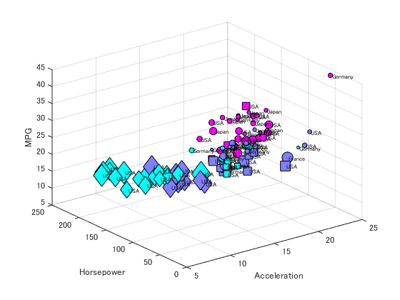
Back to this post. bubbleplot is a visualization function for high-dimensional data. If you have ever used scatter or scatter3, you probably know that you can already plot four or five dimensional data. With bubbleplot, you'll be able to visualize up to 7 dimensions. Here's an example, borrowing from the examples Ameya provides with his entry.
We'll start with a shipping sample data from the Statistics and Machine Learning Toolbox.
load carsmall
Origin = cellstr(Origin);

% Create a table for easy overview
t = table(Acceleration,Horsepower,MPG,Weight,Model_Year,Cylinders,Origin);
t(1:10,:)
ans =
    Acceleration    Horsepower    MPG    Weight    Model_Year    Cylinders    Origin
    ____________    __________    ___    ______    __________    _________    ______
      12            130           18     3504      70            8            'USA'
    11.5            165           15     3693      70            8            'USA'
      11            150           18     3436      70            8            'USA'
      12            150           16     3433      70            8            'USA'
    10.5            140           17     3449      70            8            'USA'
      10            198           15     4341      70            8            'USA'
       9            220           14     4354      70            8            'USA'
     8.5            215           14     4312      70            8            'USA'
      10            225           14     4425      70            8            'USA'
     8.5            190           15     3850      70            8            'USA'
Then create a bubbleplot using these variables. For Color and Shape, the function is able to take categorical data as well. See the help for more information.
bubbleplot(t.Acceleration, t.Horsepower, t.MPG,...  % X, Y, Z
    t.Weight, t.Model_Year, t.Cylinders,...         % Size, Color, Shape
    Origin,...                                      % Text
    'FontSize', 6);
grid on
xlabel('Acceleration')
ylabel('Horsepower')
zlabel('MPG')
The function is well-written, with good use of inputParser and plenty of error checking. People wanting to learn good programming practices should have a look. If I were to add one suggestion, I would make it so that the function output (handle objects) gets returned only when it is asked for. When I call the function without an output argument, I don't want "ans" created. Just a minor suggestion.
Thanks for a cool visualization tool, Ameya. Hope you're doing well!
Comments
Give this a try, and let us know what you think here or leave a comment for Ameya.
- Category:
- Picks


Comments
To leave a comment, please click here to sign in to your MathWorks Account or create a new one.