Sum Block: Round or Rectangular?
Working in technical support, I see a lot of Simulink models from users. I have realized that many users do not know how to, or do not take the time to configure the ports of the Sum block.
For example, when I see things like this, it makes my eyes hurt a little:
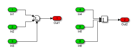
Here are a few tips to format the Sum block to make your models easier to understand.
Round Sum block
When you drag the Sum block from the Simulink Library Browser, its Icon Shape is set to Round, and it has one input port on the left and one on the bottom:
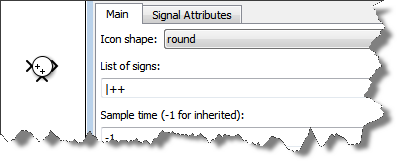
When the Sum block Icon Shape is set to Round, the ports are spread evenly from top to bottom and the vertical bar "|" can be used to skip one position. For example, if we want to add a port on top of the block, we can modify the list of signs:
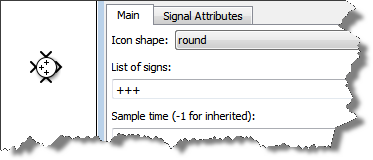
Rectangular Sum block
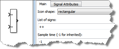
If you change the Icon Shape property of the default Sum block to Rectangular, the block will look like the following:
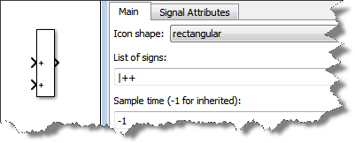
Personally, I can not think of a good reason for skipping a port in Rectangular shape. So I almost always remove the "|" when I change the shape to Rectangular.
Sum of Elements
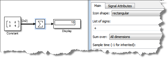
One way I like to use the Sum block is to sum all the elements of a vector or matrix:
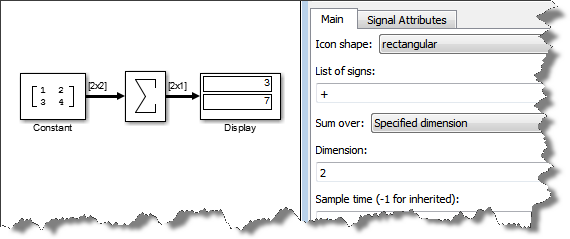
For matrices, the Sum block can also be configured to Sum only over one specific dimension:
Round or Rectangular?
One question remains: When should the Sum block be Round and when should it be Rectangular?
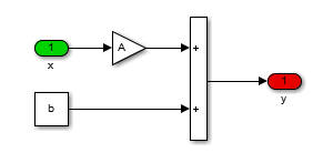
There is no absolute rule, but personally I like to use the Rectangular shape when implementing equations that flow from left to right, without obvious feedback. For example:
I keep the Round shape for when I want to make it obvious that there is a feedback involved:

Now it's your turn
Please share with us if you have rules or guidelines on the format of your blocks by leaving a comment here.
- カテゴリ:
- Modeling,
- Signals,
- Simulink Tips



コメント
コメントを残すには、ここ をクリックして MathWorks アカウントにサインインするか新しい MathWorks アカウントを作成します。