
Individual Axis Customization
The R2015b release contains some new features for individual axis customization. Ben Hinkle, who works with the graphics team sometimes, goes through a number of plotting scenarios where these features can help simplify your code. This post shows some nicer techniques for making these pretty plots using R2015b vs. those in Loren's recent post using early versions of MATLAB.
Contents
Plotting temperature data
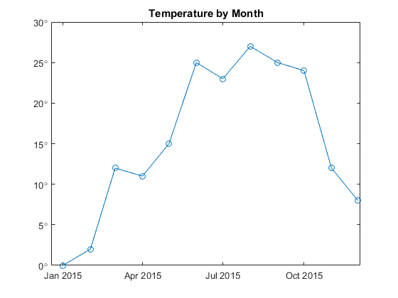
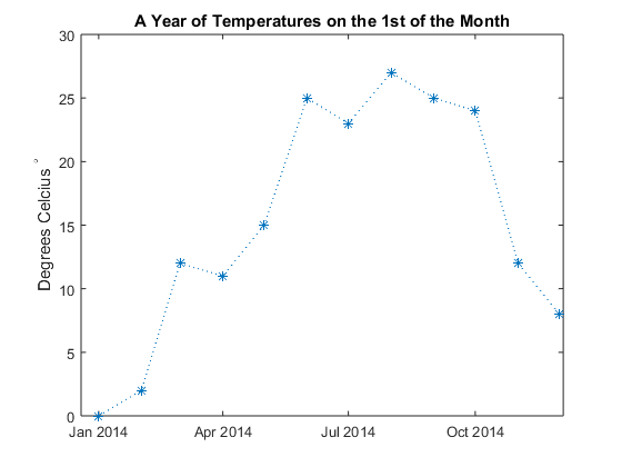
To begin, let's plot some sample temperature data across a full year.
t1=datetime(2015,1:12,1);
temp = [0 2 12 11 15 25 23 27 25 24 12 8];
plot(t1,temp,'-o');
title('Temperature by Month')

Tick labels for degrees
To access the new features, you get the current axes object by storing the result of gca in a variable. Then you use the XAxis, YAxis or ZAxis properties to customize a particular axis. Let's customize the y-axis tick labels to contain a degree symbol. The syntax for the TickLabelFormat property is a printf format. These formats use %g to stand for the default numeric formatting and \\circ to get the TeX command for a degree symbol. Why \\circ and not just \circ? The reason is that \ is the escape character for both TeX and printf formats. So we have "escape the escape" by writing \\.
ax = gca;
ax.YAxis.TickLabelFormat = '%g\\circ';
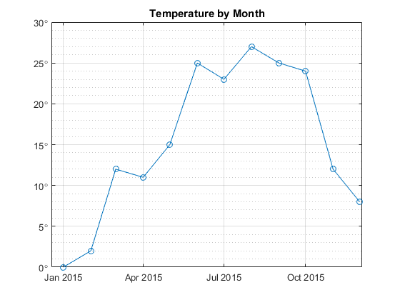
Minor tick control
Let's turn on the grids to make it easier to read off values from the chart.
grid on
ax.YMinorGrid = 'on';

We can control the spacing of the minor tick using the new MinorTickValues property. For example, let's set the minor step to be one degree.
step = 1;
ax.YAxis.MinorTickValues = setdiff(0:step:30,ax.YTick);
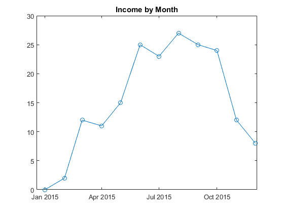
Plotting currency data
Suppose we plot currency data instead of temperature data. Here is the same dataset as before except this time we'll customize the y-axis for currency values. The next several sections will step through the process slowly. First, let's make the plot without any y-axis customization.
income = temp;
plot(t1,income,'-o');
title('Income by Month')
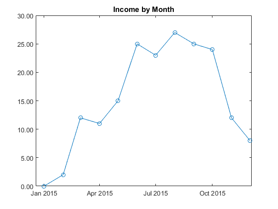
Tick label precision
We can show the tick labels with exactly two decimal places by customizing the tick label format. The format %.2f specifies exactly 2 digits of precision after the decimal point. The f stands for "fixed".
ax.YAxis.TickLabelFormat = '%.2f';
By the way, does anyone know the true history behind the abbreviations in printf formats? The format g presumably stands for "general" but I've never found real proof.
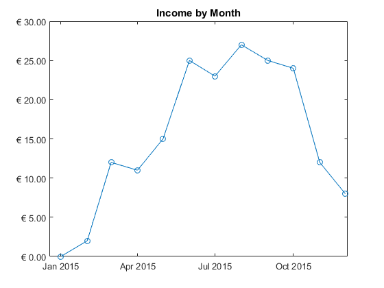
Tick labels for currency
We can do even better by prepending a currency symbol. The unicode codepoint for the euro, for example, is 02AC in hexidecimal. The printf format \xNNNN produces a single character with unicode hexidecimal value NNNN. Prepend the euro (and a single space) to our existing format.
ax.YAxis.TickLabelFormat = '\x20AC %.2f';
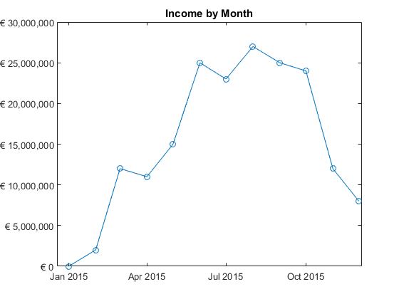
Formatting for large integer ticks
Suppose now our income ranges from 0 to 30 million instead of just 0 to 30. We can use the format %,d to get integers with commas inserted every three digits. The comma flag "," is an extension which is only supported in graphics and is not available generally in MATLAB. The comma flag can be used with any of the format types. A common mistake is to use %d for doubles. Instead %d produces "decimal" integers.
plot(t1,income*1e6,'-o');
title('Income by Month')
ax.YAxis.Exponent = 0;
ax.YAxis.TickLabelFormat = '\x20AC %,d';
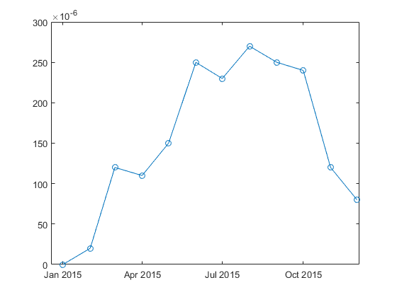
Exponent control
The previous section set the y-axis Exponent to 0 to suppress the usual graphics behavior of factoring out large powers of 10. We can set the Exponent to other values to specify a particular power of 10. For example, we can set the exponent to a negative value like -6.
data = temp;
plot(t1,data*1e-5,'-o')
ax.YAxis.Exponent = -6;
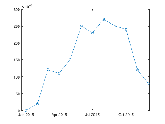
Font and line control
We can also customize the fonts, lines and other properties for individual dimensions. For example,
ax.YAxis.FontWeight = 'bold';
ax.YAxis.LineWidth = 2;
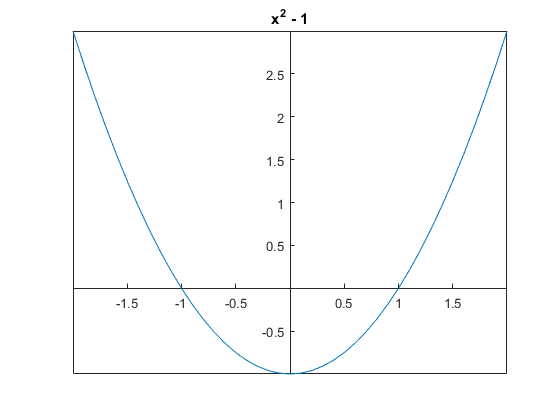
Axes crossing through the origin
A final customization is the ability to draw the x-axis and y-axis through the origin. This is done using the new 'origin' value for the XAxisLocation and YAxisLocation properties.
x = -2:.1:2;
plot(x, x.^2-1)
title('x^2 - 1')
ax.XAxisLocation = 'origin';
ax.YAxisLocation = 'origin';
Conclusion
That ends the tour of new R2015b features for individual axis customization. Which new feature will be most useful for you? Let us know here.
- Category:
- Graphics,
- New Feature


Comments
To leave a comment, please click here to sign in to your MathWorks Account or create a new one.