
Alternative Box Plot
Sean's pick this week is Alternative Box Plot by Christopher Hummersone.
Background
I was recently doing a seminar for some MATLAB users where one of the plots I showed was a boxplot. The box plot was used to quickly get a feel for the distributions of some energy data based on time of day. Here it is:
figure
boxplot(Power, Hour, 'Notch', 'on')
xlabel('Hour of Day')
ylabel('Power (MW)')
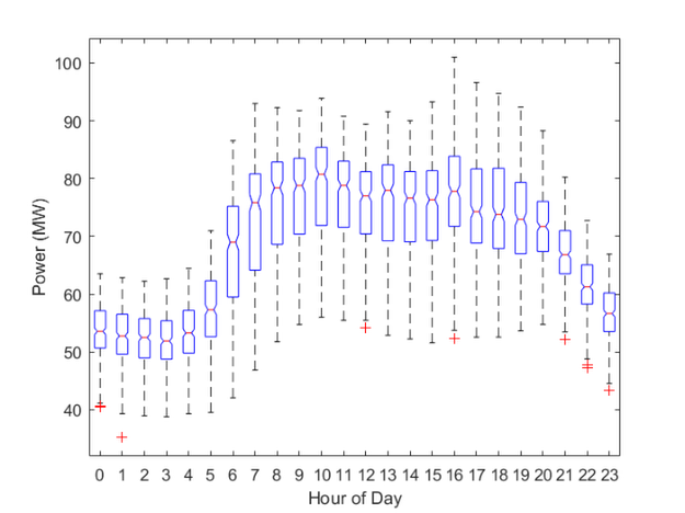
There is a lot of information in this plot. The whiskers are the limits excluding outliers which are the red +s. The boxes represent the 25th and 75th percentiles, the red line the median, and the notches tell you if two medians are significantly different if they don't overlap.
An audience member then asked me if there was a way to control the box limits to be an arbitrary percentile, they wanted 10% and 90%. I searched the parameter-value pairs but did not find anything.
Enter Alternative Box Plot!
Alternative box plot provides many of the same options as MATLAB's boxplot but also a few more and the percentile is one of them.
Christopher has his tools in a package, which is nice to avoid naming conflicts with other functions. I'll import the package to use the short name:
import iosr.statistics.*
y = tab2box(Hour,Power); % reshapes to be boxPlot compliant
bp = boxPlot(0:23,y,'Notch',true,'Percentile',[10 90]);

Very nice!
You may have also noticed that I grabbed an output argument. This allows me to customize the box plot with easy tab completion after it's already made.
bp.lineColor = 'b';
bp.medianColor = 'r';

In fact, I could even have all four percentiles by adding additional ones.
bp = boxPlot(0:23,y,'Notch',true);
bp.addPrctiles = [10 90];
bp.addPrctilesColors = {'r';'b'}
bp =
  boxPlot with properties:

           addPrctiles: [10 90]
     addPrctilesColors: {2×1 cell}
     addPrctilesLabels: {2×1 cell}
    addPrctilesMarkers: {2×1 cell}
    addPrctilesTxtSize: []
              boxAlpha: 1
              boxColor: {'none'}
              boxWidth: 'auto'
    groupLabelFontSize: 9
      groupLabelHeight: 'auto'
           groupLabels: {1×0 cell}
            groupWidth: 0.7500
                 limit: '1.5IQR'
             lineColor: {'k'}
             lineStyle: {'-'}
             lineWidth: 1
             meanColor: {[0 0.4470 0.7410]}
            meanMarker: {'+'}
              meanSize: 6
           medianColor: {[0 0.4470 0.7410]}
                method: 'R-5'
                 notch: 1
            notchDepth: 0.4000
        notchLineColor: {'k'}
        notchLineStyle: {':'}
             notchLine: 0
           outlierSize: 36
            percentile: [25 75]
        sampleFontSize: 9
            sampleSize: 0
            scaleWidth: 0
          scatterAlpha: 1
          scatterColor: {[0.5000 0.5000 0.5000]}
          scatterLayer: 'top'
         scatterMarker: {'x'}
           scatterSize: 36
            showLegend: 0
              showMean: 0
          showOutliers: 1
           showScatter: 0
                 style: 'normal'
           symbolColor: {[0 0.4470 0.7410]}
          symbolMarker: {'o'}
                 theme: 'default'
            xSeparator: 0
              xSpacing: 'x'
               handles: [1×1 struct]
                     x: [1×24 double]
                     y: [334×24 double]
               weights: [334×24 double]
            statistics: [1×1 struct]

Comments
Give it a try and let us know what you think here or leave a comment for Christopher.
- Category:
- Picks


See Also
-
Box plot + Scatter plot
Blogs
-
Distribution Plot
Blogs
-

Boxplots made easy
Blogs


Comments
To leave a comment, please click here to sign in to your MathWorks Account or create a new one.