
Spider Plot II – Custom Charts (Intro)
Sean‘s pick this week is spider_plot by Moses.
Contents
Custom Charts
My pick this week is also spider_plot which Jiro picked a few months ago. Jiro added argument validation, of which we’re obviously big fans(!), to it. Here, I’m going to take it a step further and create a custom chart for it; this is also a new R2019b feature.
If you look at the signature for spider_plot now, it does not return an output argument. If you want to change it after it’s created, you either need to find the underlying graphics objects using findobj and adjust them, or delete and recreate the chart, probably by clearing the axes with cla. The pieces of the spider_plot may show up in the graphics hierarchy, but the spider_plot itself will not. Because they’re not encapsulated, a user could corrupt them accidentally or struggle to make a change that looks like what they want.
By creating a custom chart we get the benefits of encapsulation, our object appearing in the graphics hierarchy, automatic input handling, and give a chart user the same experience they would have with a MathWorks authored chart (e.g. confusionchart, heatmap). Additionally, and possibly most importantly, by creating a custom chart, we can tie into the automatic updates in the graphics system hierarchy caused by drawnow in order to be efficient about updates.
Using the Custom Chart
Over the holiday downtime, I converted Moses’ spider_plot to a custom chart, I’ve creatively named SpiderChart. Today, let’s just play with the finished chart.
s = SpiderChart(rand(3,5))
s =

  SpiderChart with properties:

                   P: [3×5 double]
        AxesInterval: 3
       AxesPrecision: 1
          AxesLimits: []
          FillOption: off
    FillTransparency: 0
               Color: [7×3 double]
           LineStyle: '-'
           LineWidth: 2
              Marker: 'o'
          MarkerSize: 8
       LabelFontSize: 10
        TickFontSize: 10
          AxesLabels: [1×100 string]
          DataLabels: [1×100 string]
            Position: [0.1300 0.1100 0.7750 0.8150]
               Units: 'normalized'

  Use GET to show all properties
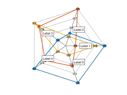
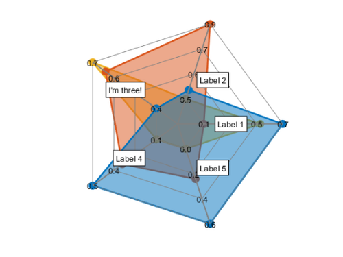
You can see that the returned object is a SpiderChart. Now, let’s adjust the filling:
s.FillOption = 'on';
s.FillTransparency = 0.5;

And adjust the label of the third axis.
s.AxesLabels(3) = "I'm three!";
What about if the data change?
s.P = randn(2,6);
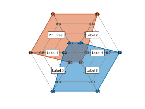
See how everything updated for this?
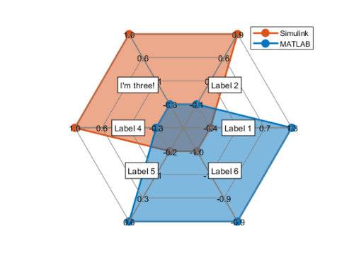
s.DataLabels = ["MATLAB" "Simulink"];
legend show
Next week, we’ll look at authoring the custom chart!
Comments
Do you have a use for custom charts or a chart you would like MathWorks to make?
Give it a try and let us know what you think here or leave a comment for Moses.
Published with MATLAB® R2020a
- Category:
- Advanced MATLAB,
- Picks


Comments
To leave a comment, please click here to sign in to your MathWorks Account or create a new one.